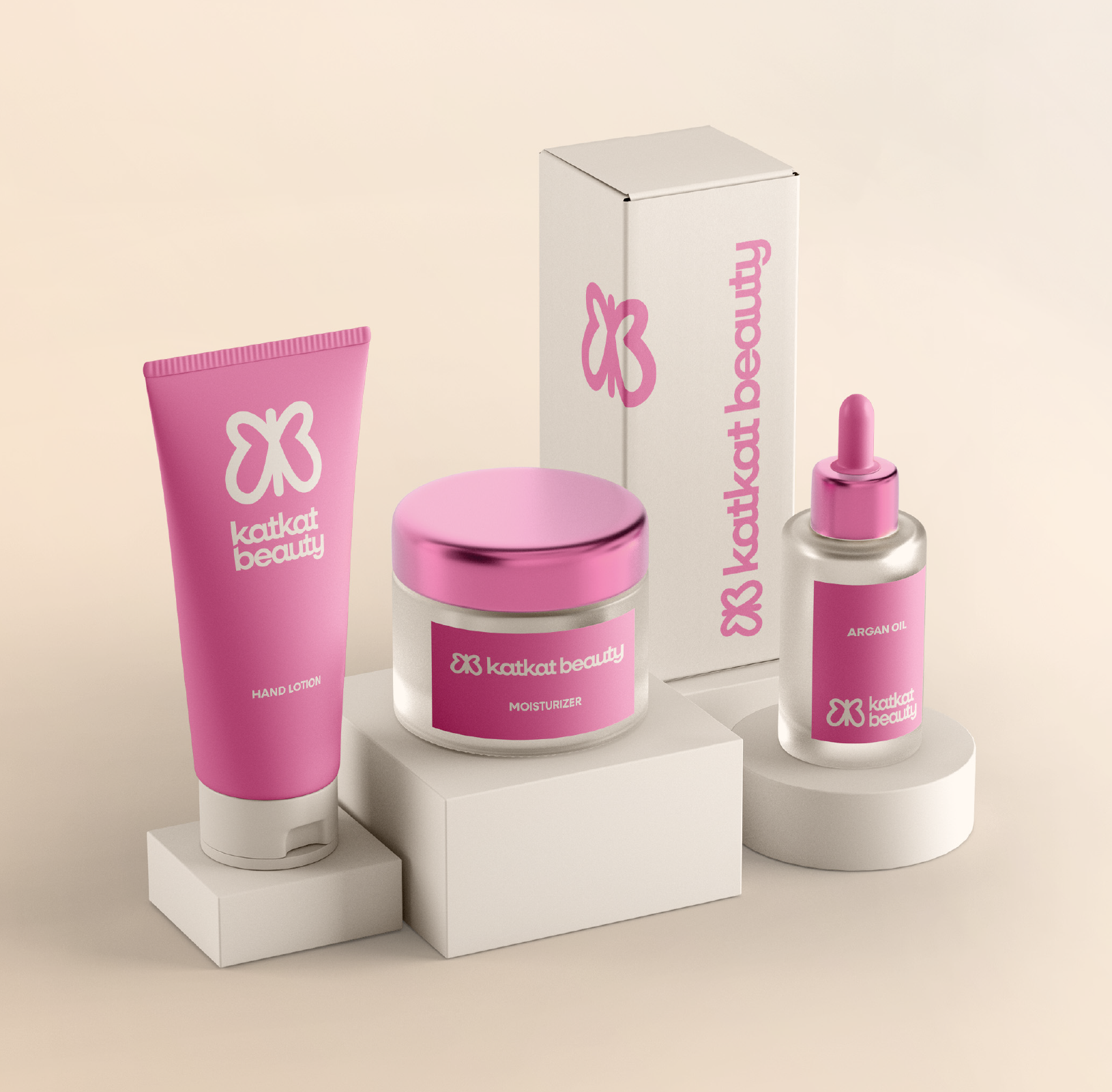
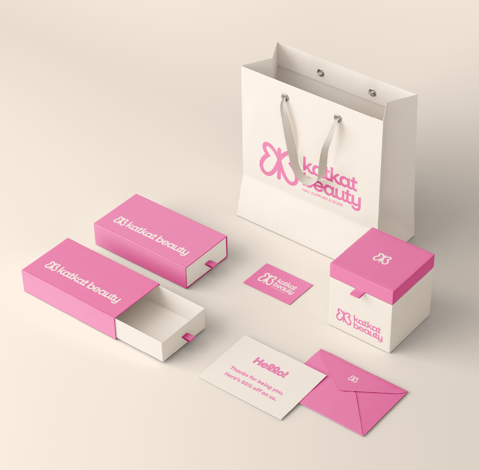
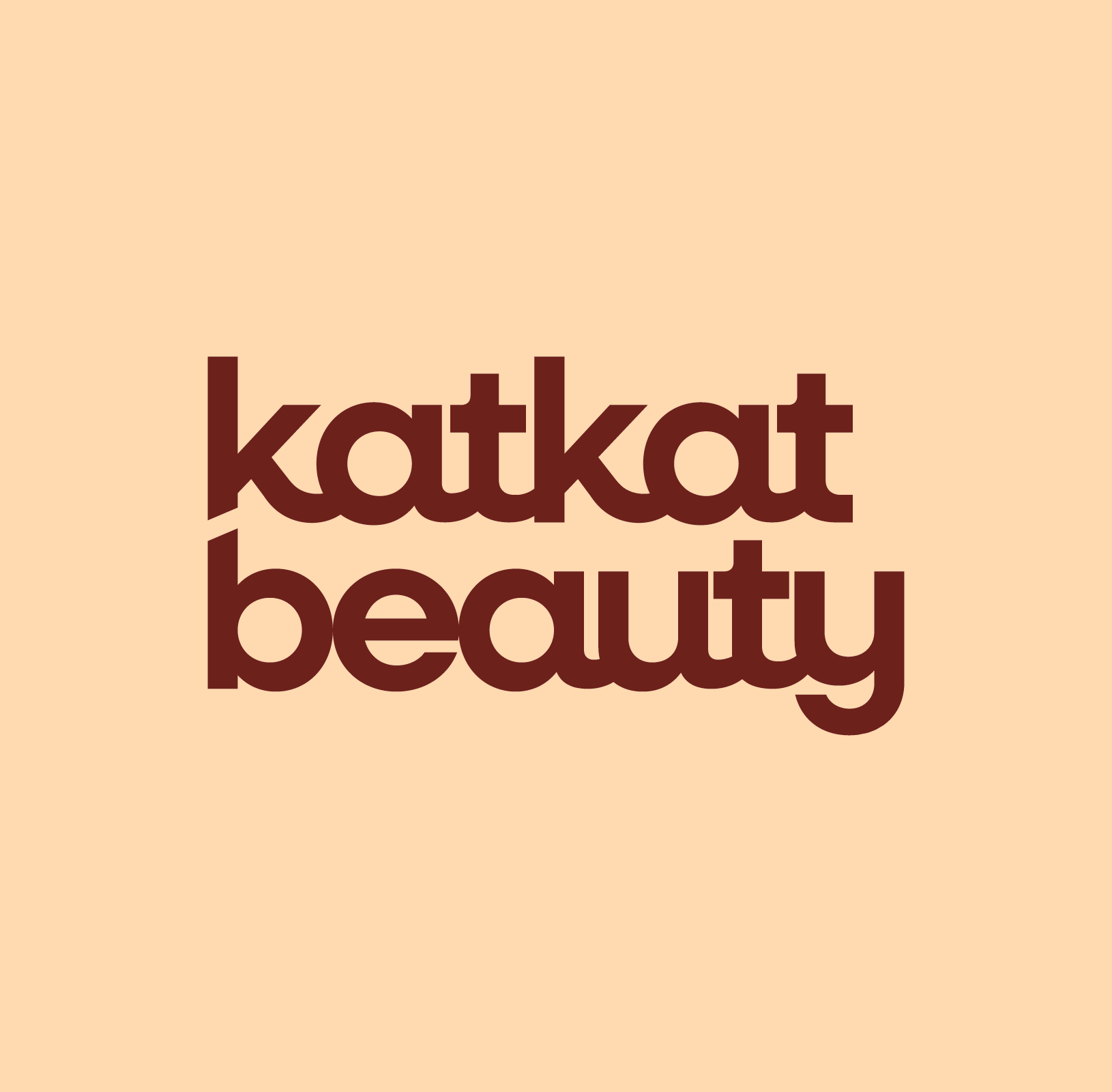
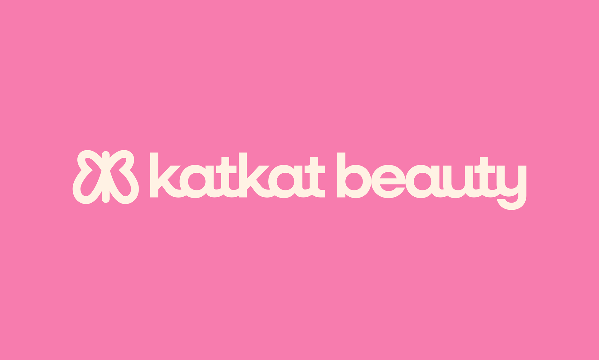
CASE STUDY: KATKAT BEAUTY
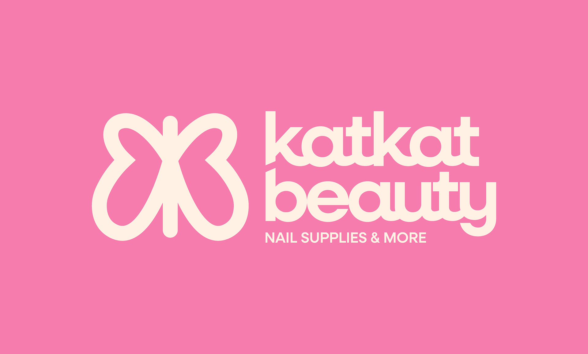
KatKat Beauty, formerly Elufa Trading, offers high-quality nail supplies and more to wholesale and retail clients. The main goal for this rebrand was to create a unique visual identity that would establish them as a trusted leader in the nail industry. They also wished to expand their product line to include new and trending nail care items. I designed packaging concepts to accompany the rebrand, and showcase the possibilities for new products.
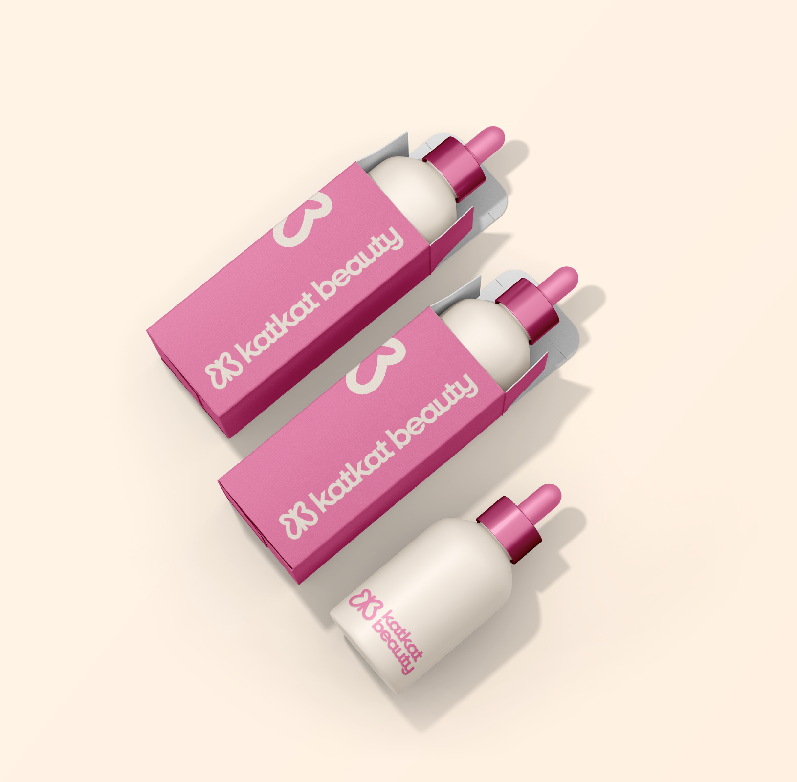
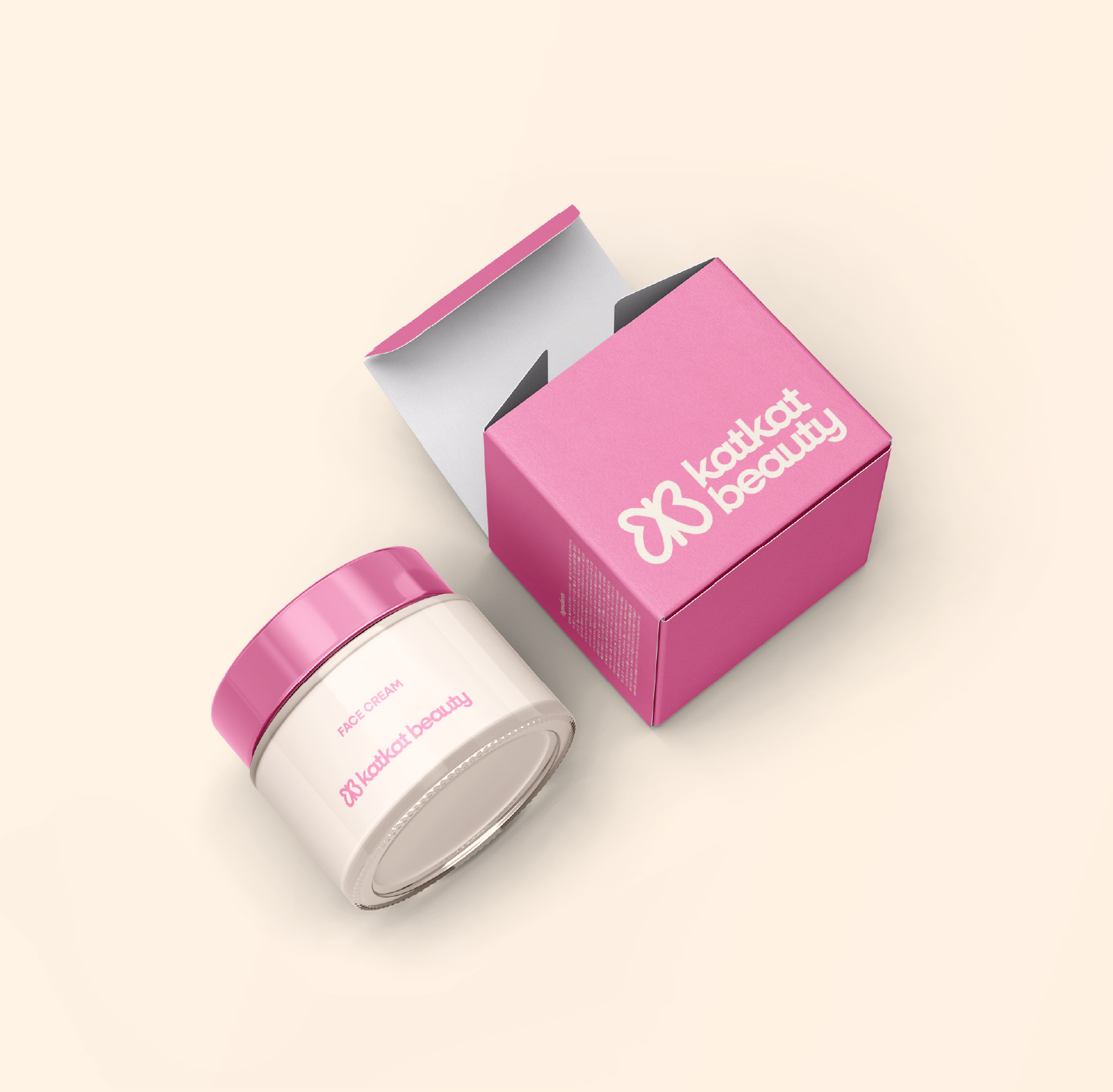
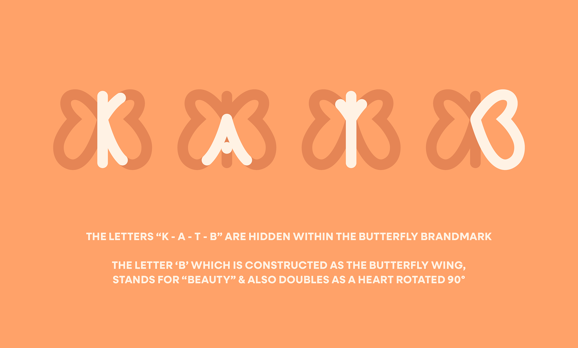
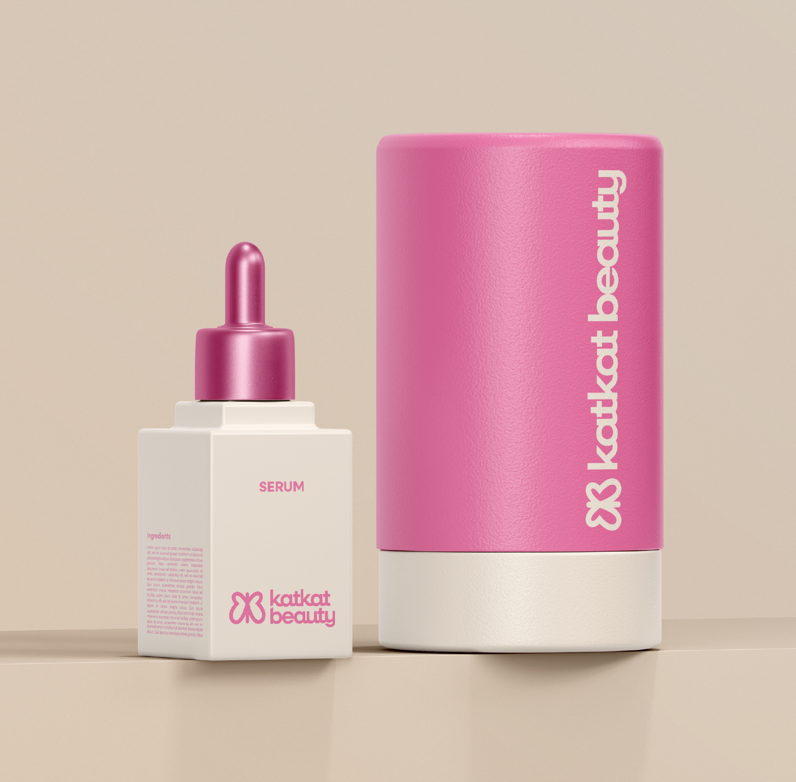
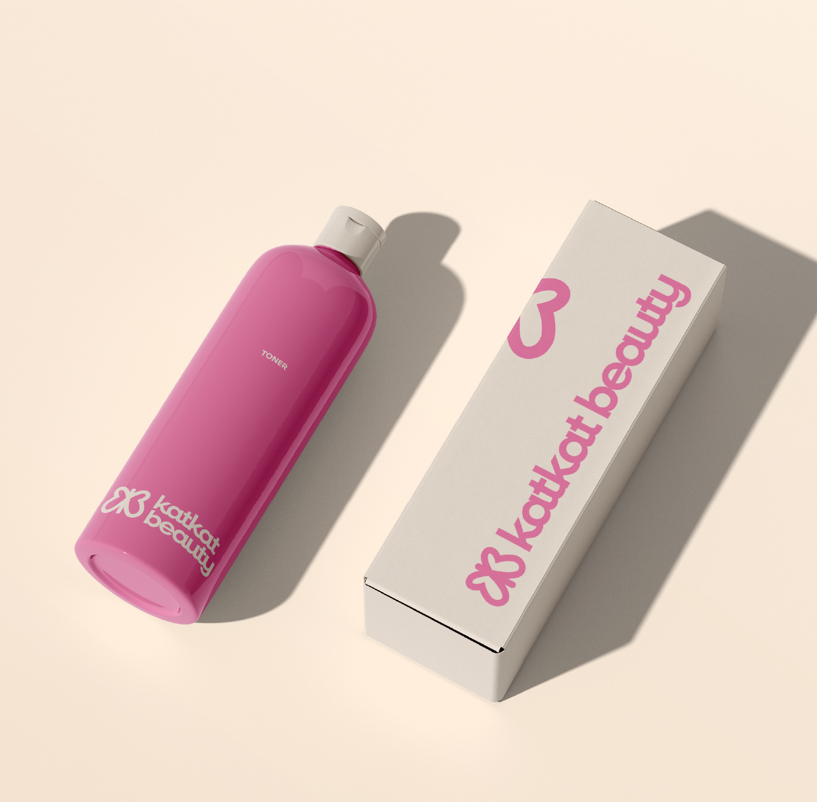
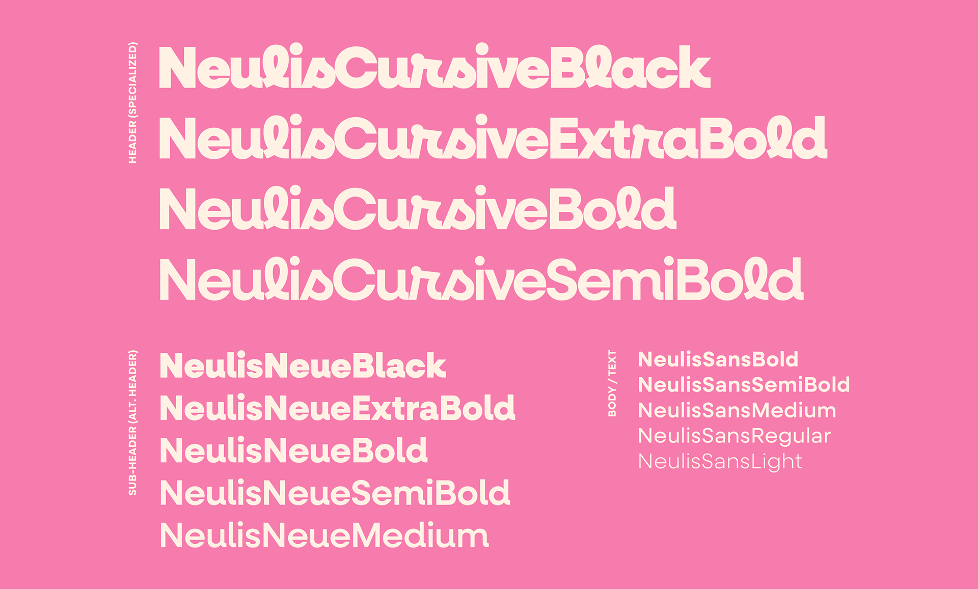
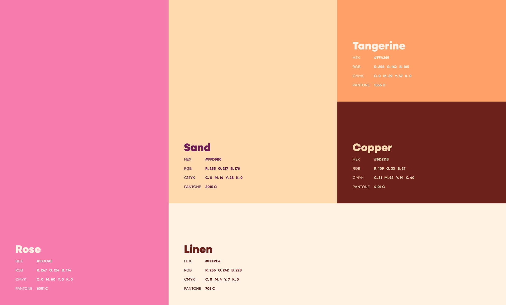
I chose a decorative header font that immediately grabs attention, speaking to KatKat Beauty's loyalists and helping to attract new customers. Paired with its Neulis flankers, this font system creates an energetic and personable atmosphere that matches what the KatKat Beauty team provides to their clients everyday. To compliment this, I built a playful, warm color palette thats fosters a welcoming feeling, as another one of their goals was to strengthen relationships with their existing wholesale partners.

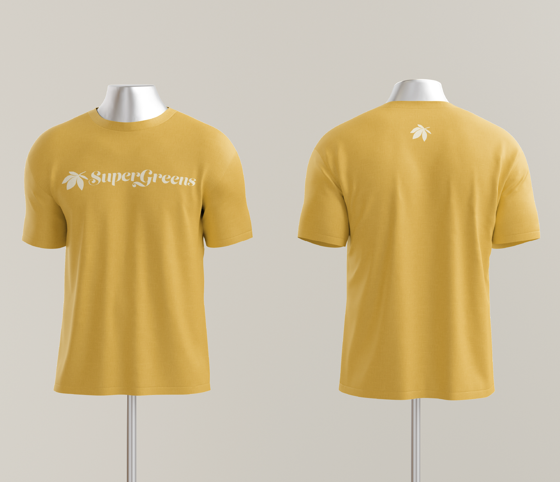
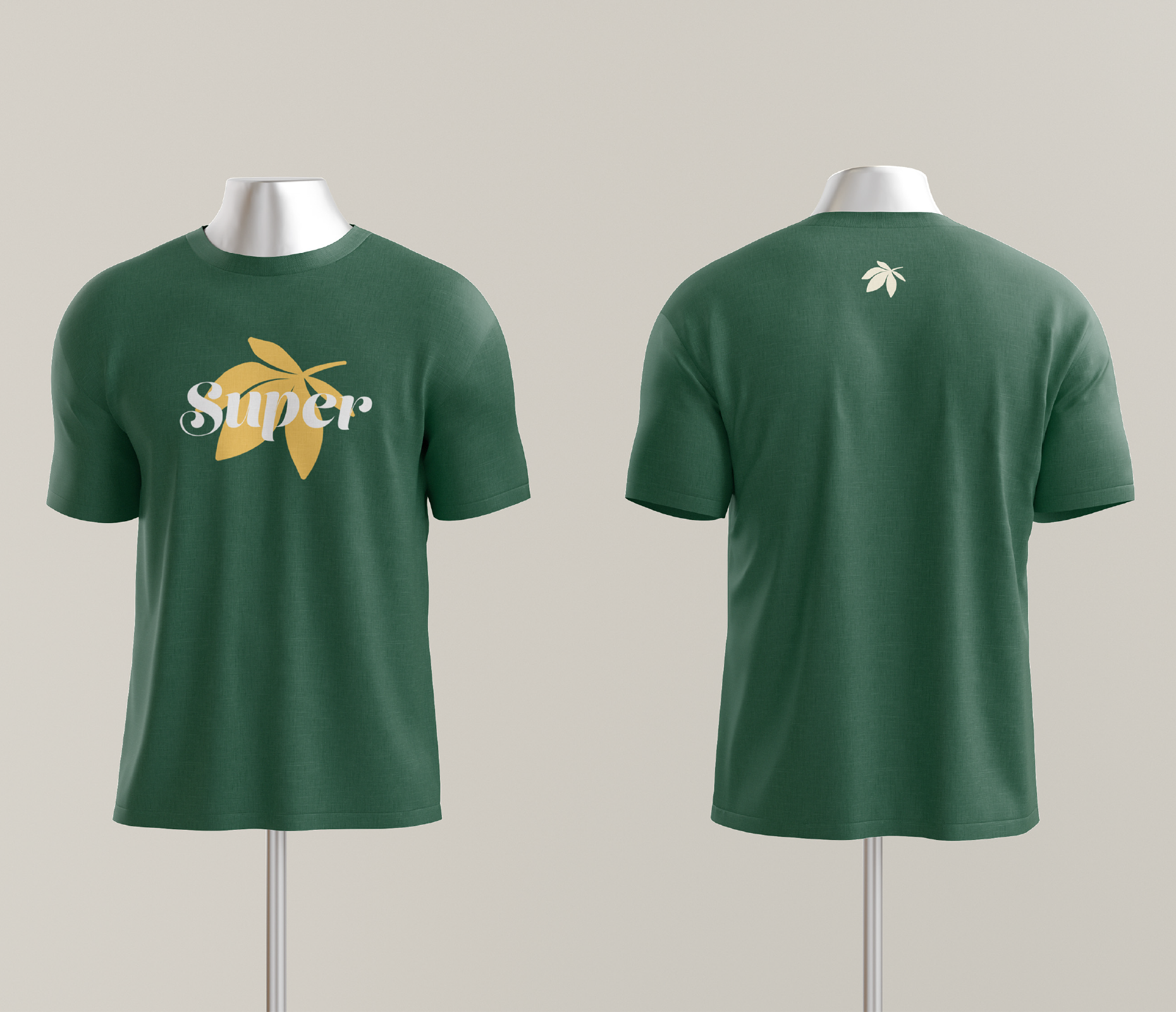
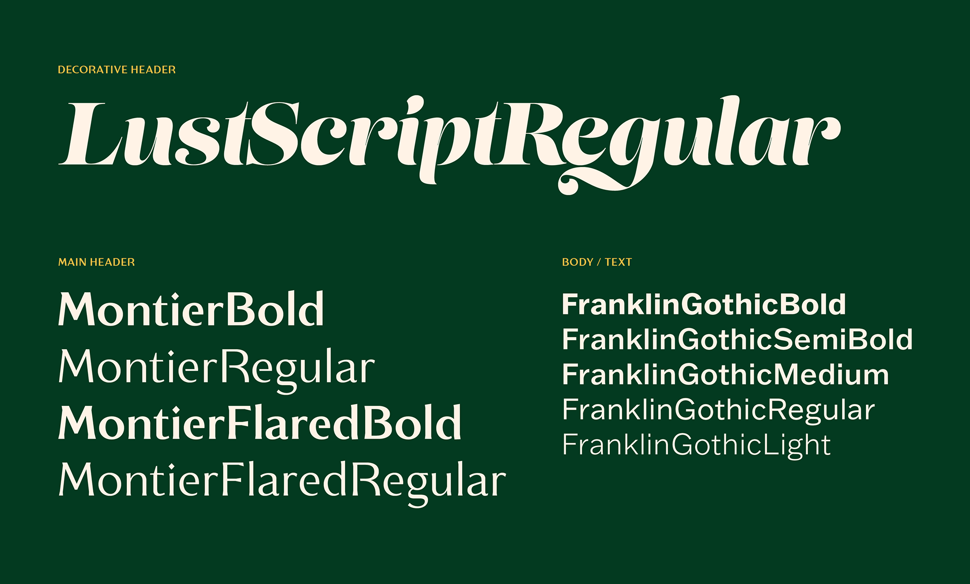
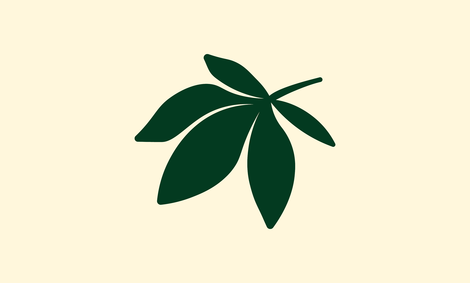
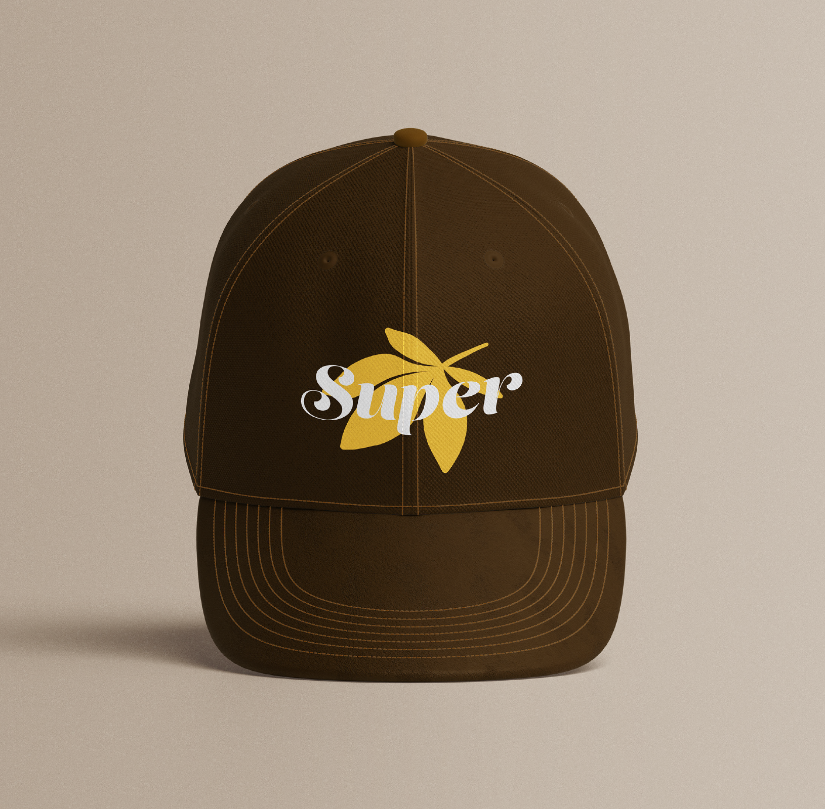
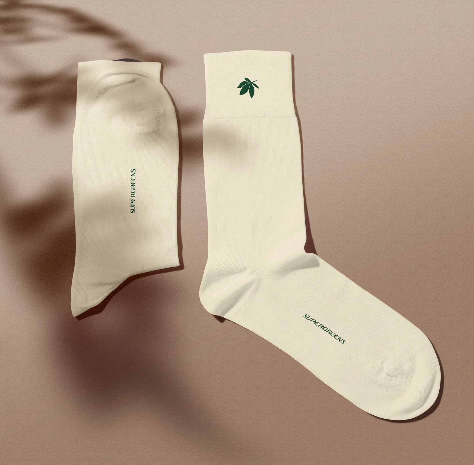
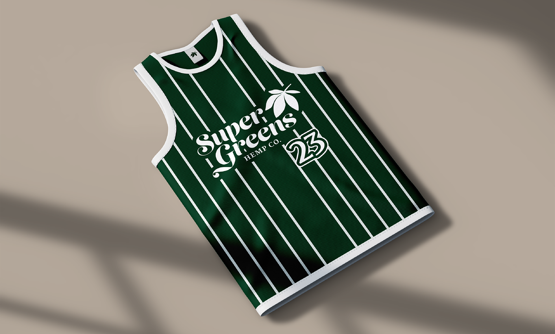
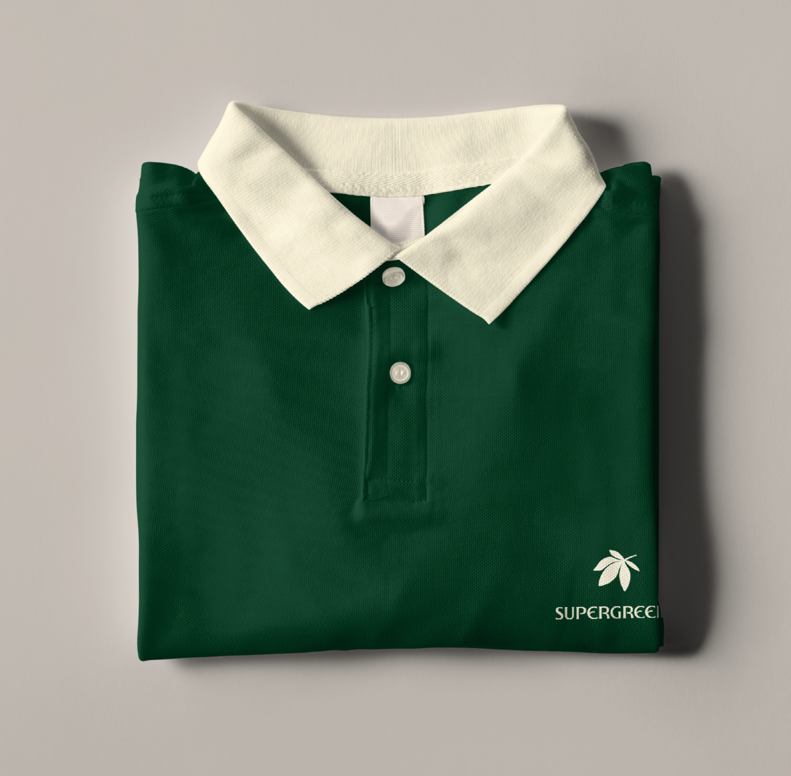
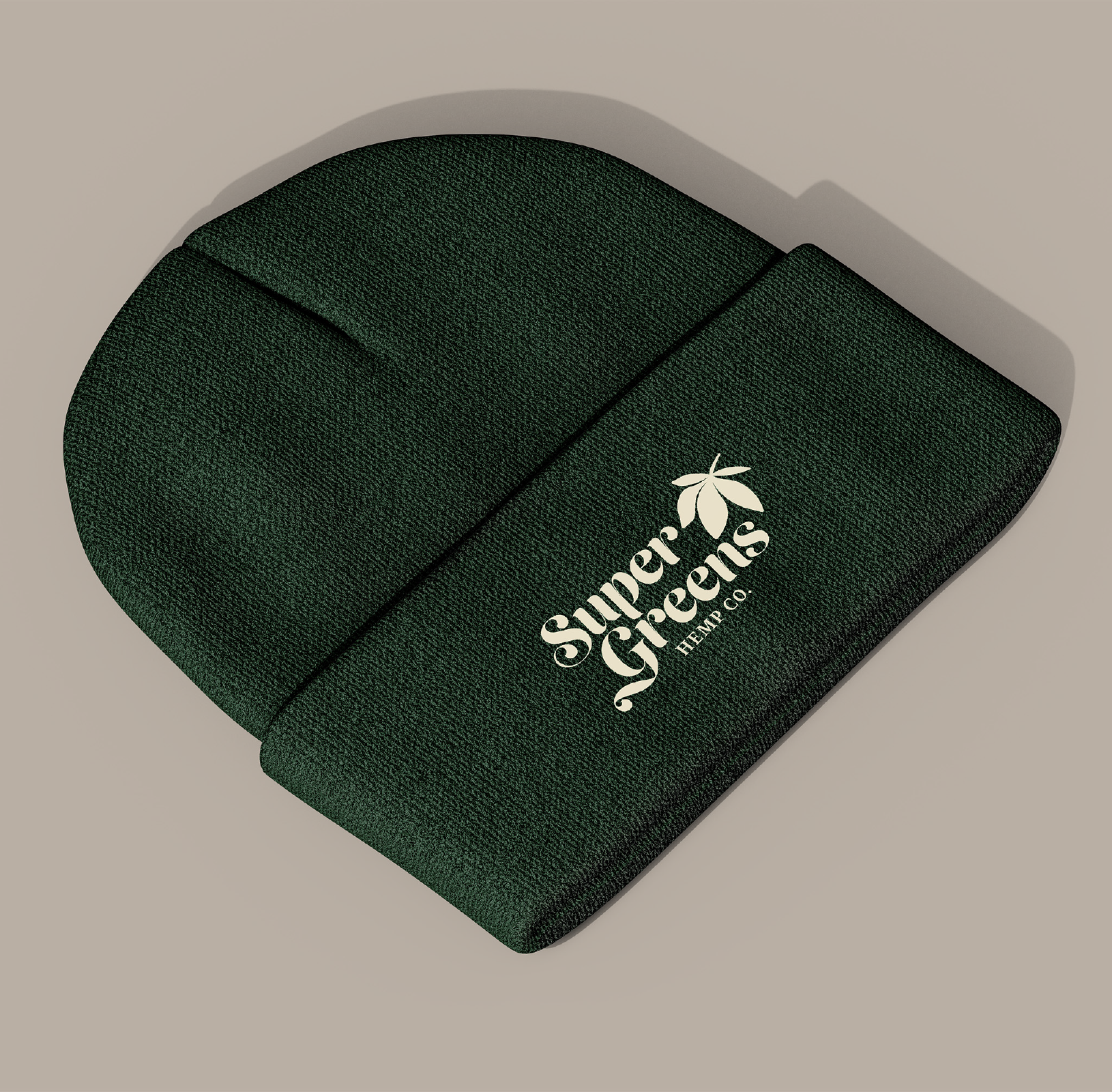
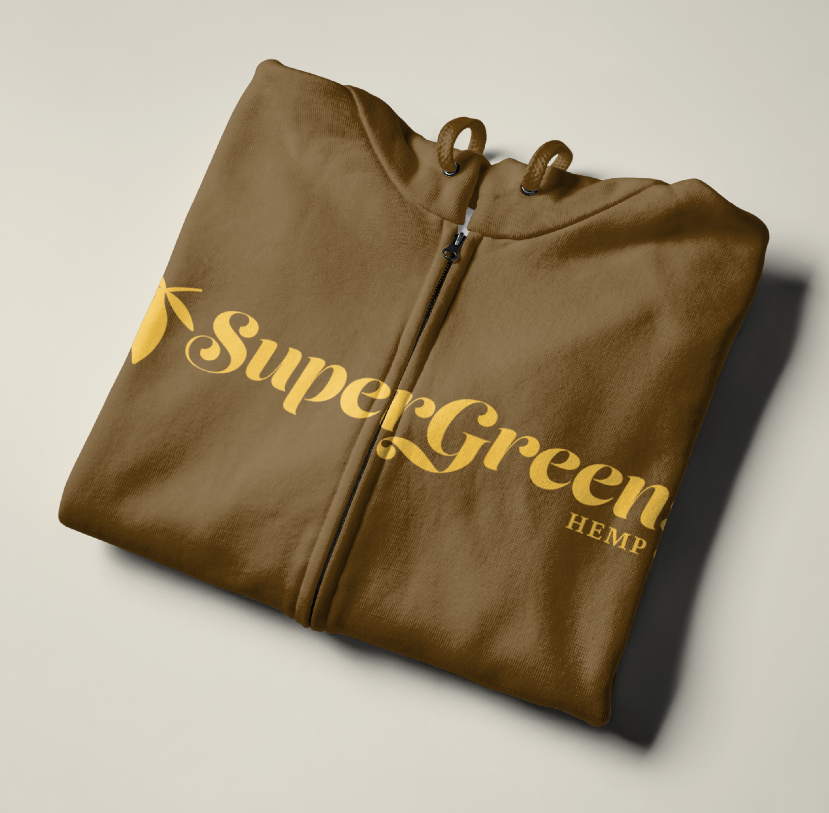
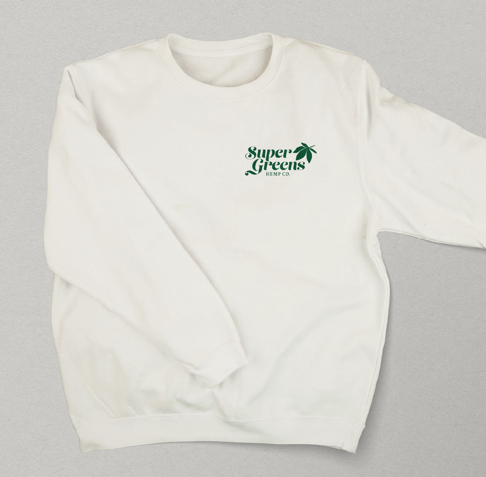
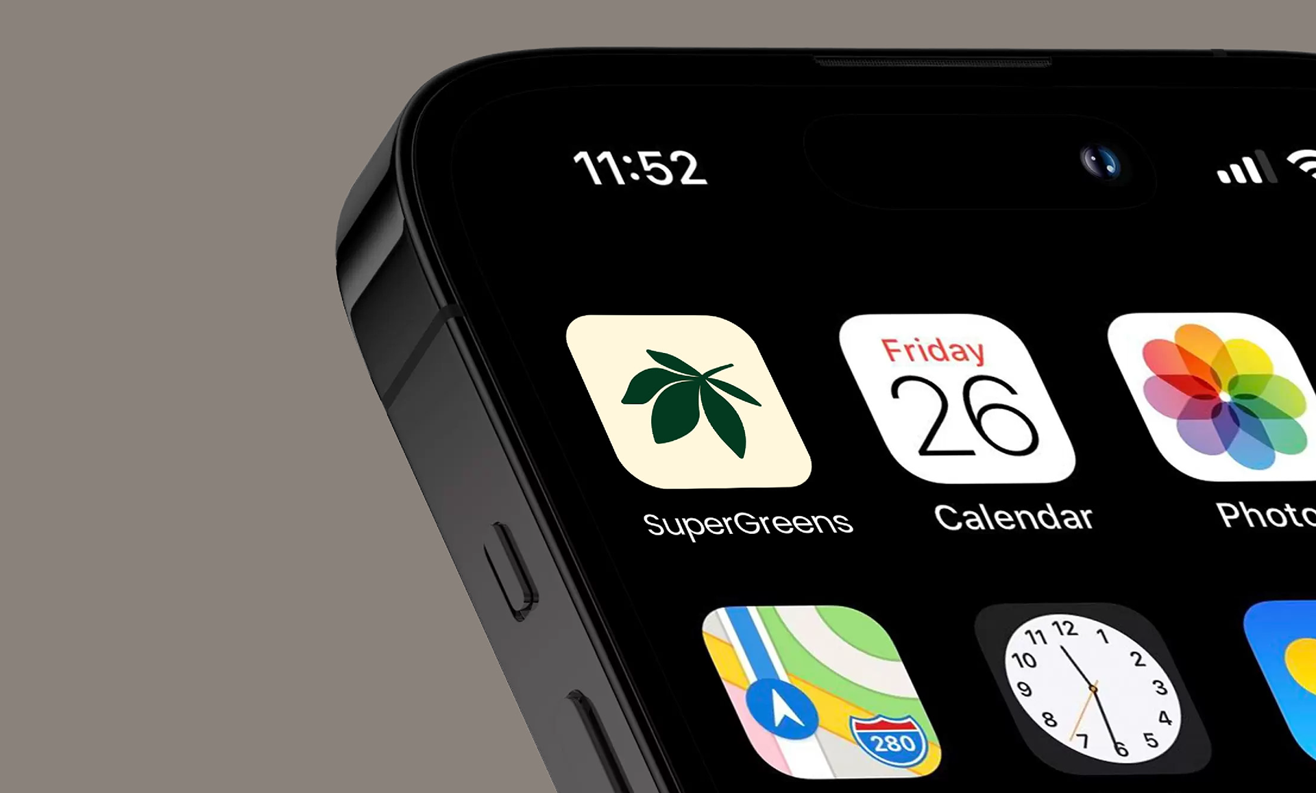
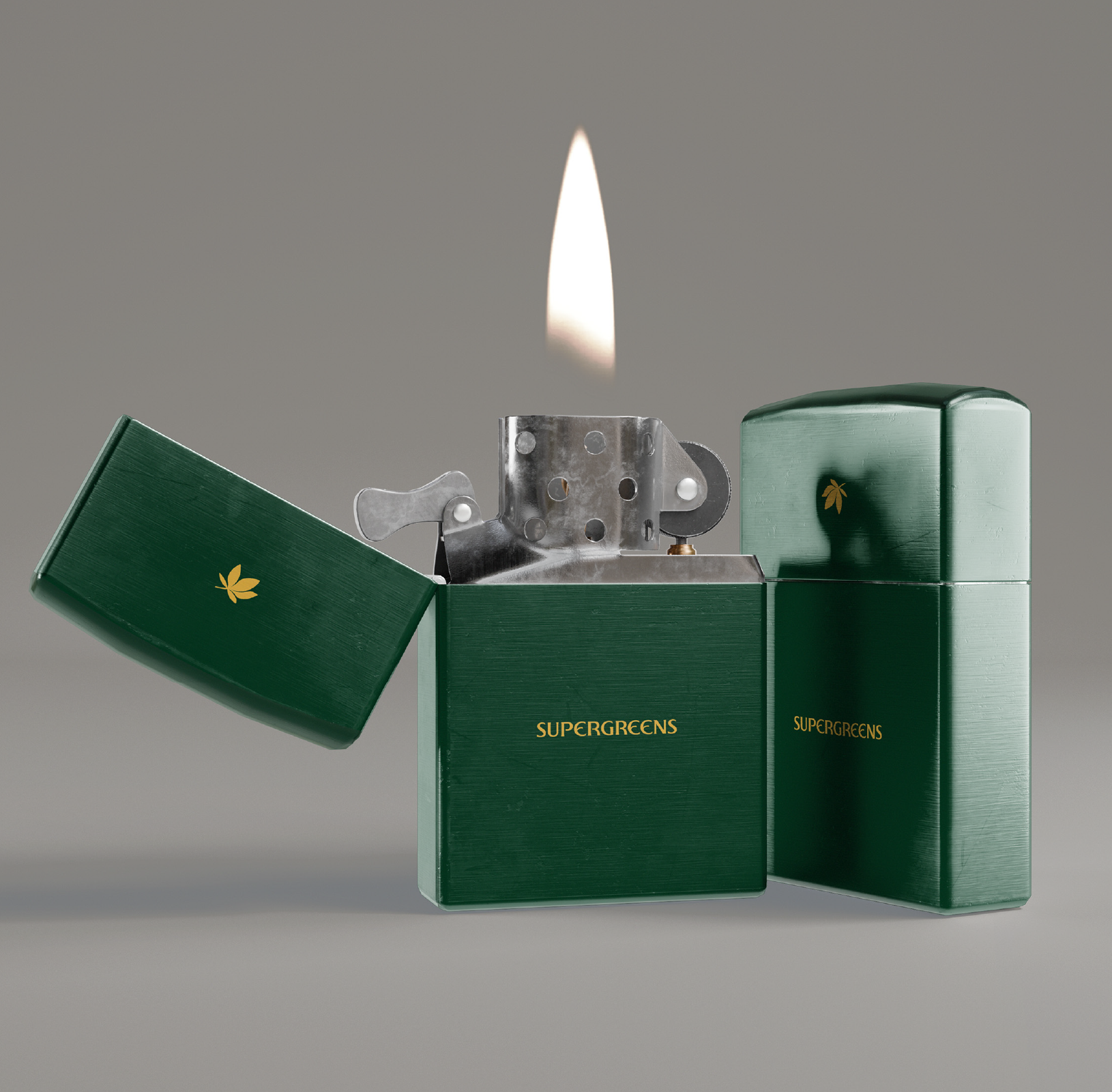
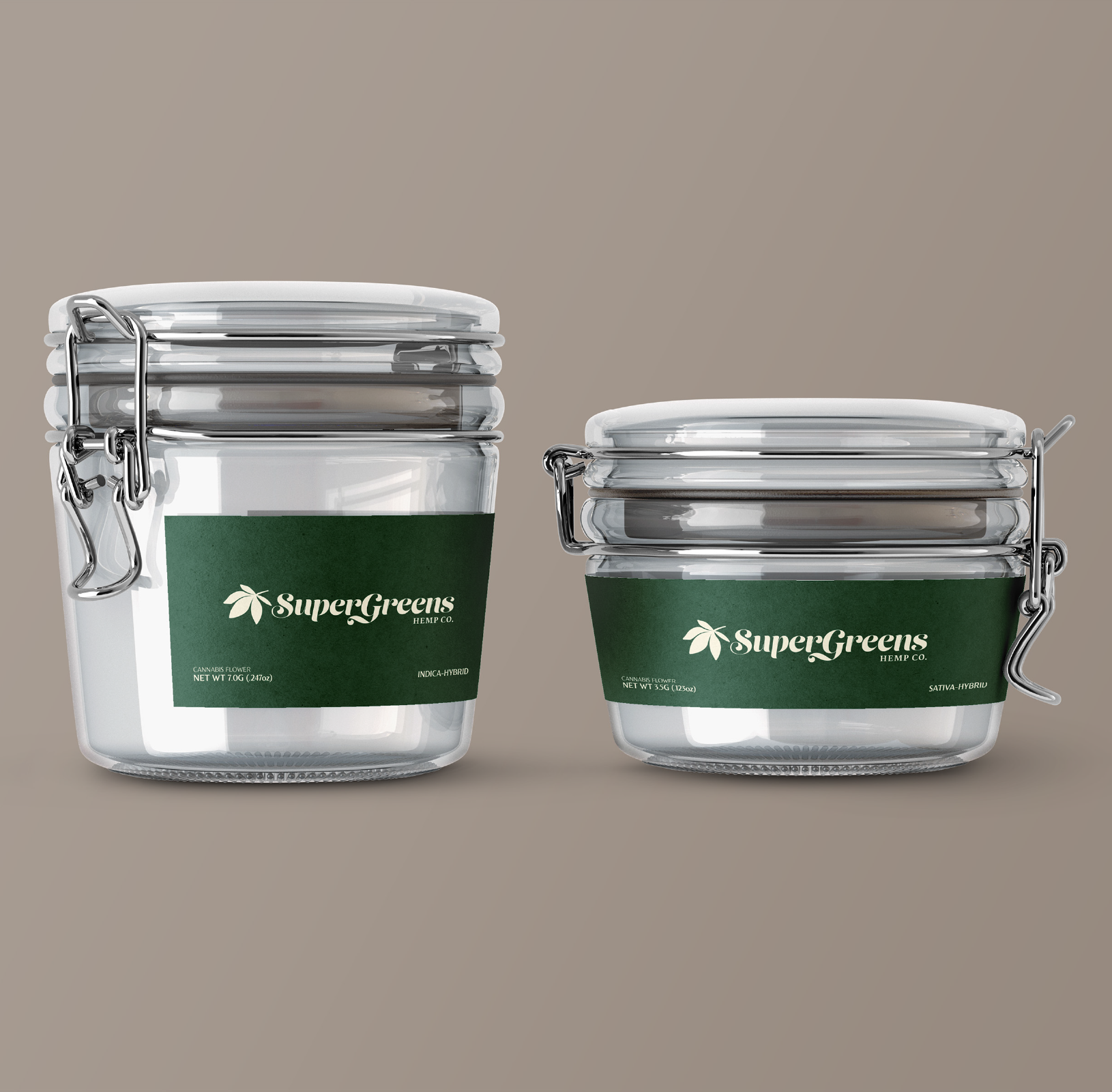
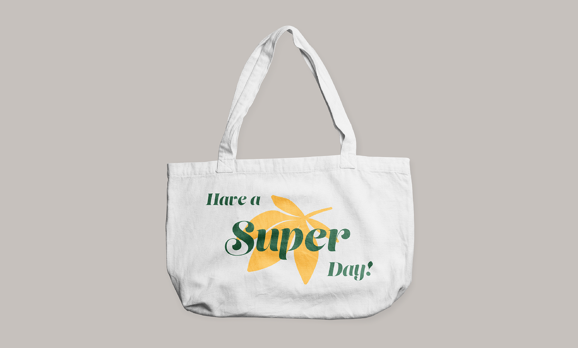
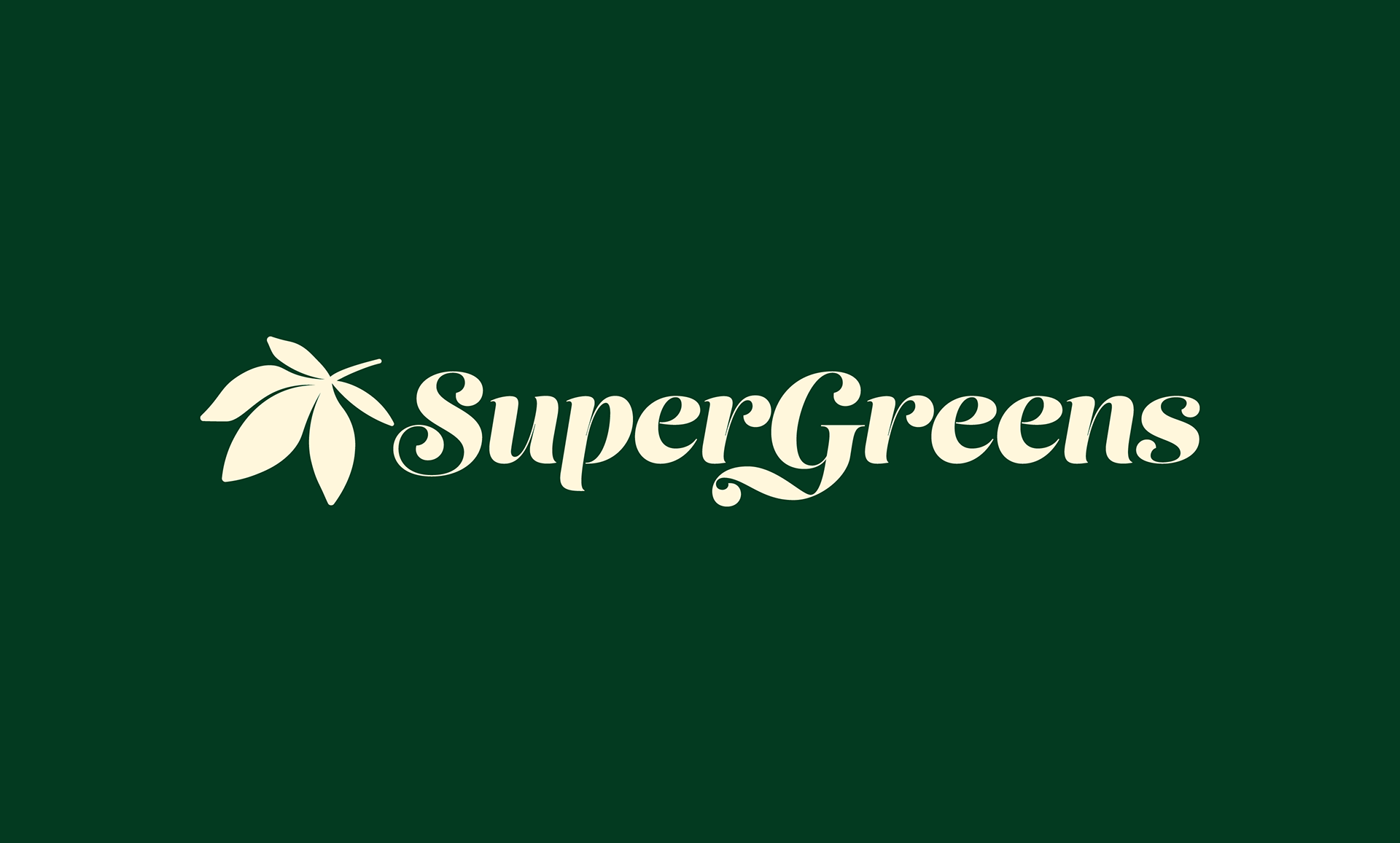
CASE STUDY: SUPERGREENS HEMP CO.
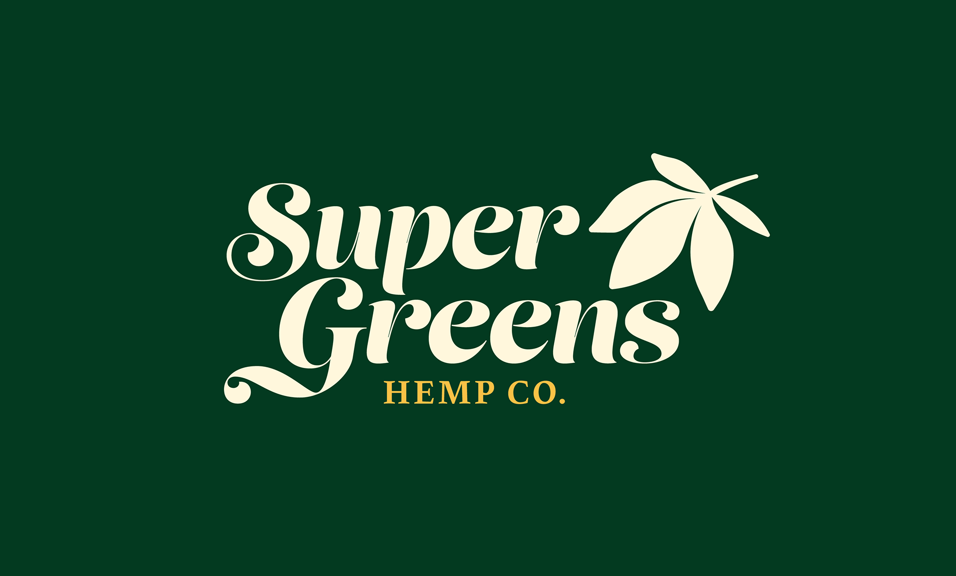
SuperGreens Hemp Co. launched in 2024 as an online dispensary specializing in premium federally-legal THCa flower and other hemp-derived products. Everything they offer is lab-verified and organically cultivated. I designed their new identity to reflect the brand's core values of quality, transparency, sustainability, and satisfaction. This comprehensive logo suite ensures flexibility, optimized for consistent performance across digital spaces and on physical products.
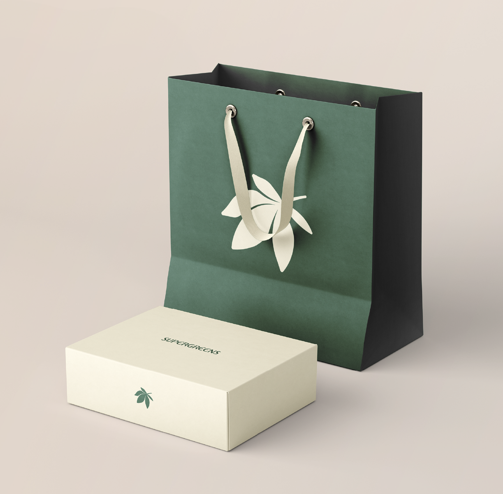
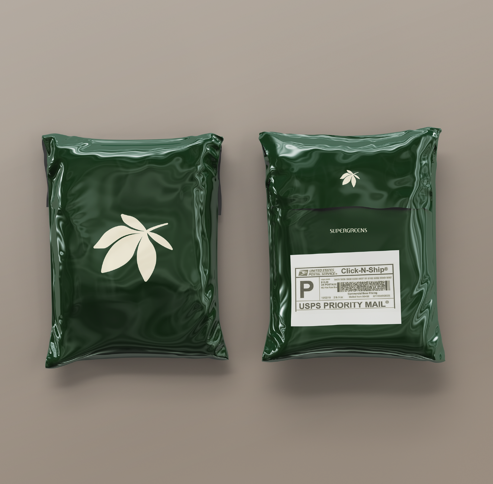
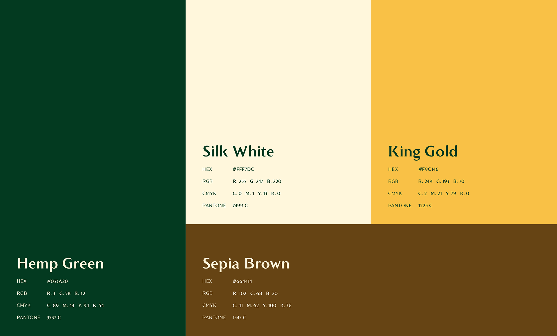
I developed an earthy color palette to communicate SuperGreens' commitment to providing their customers with natural, organic, non-GMO products – free of pesticides, chemicals, synthetics, and heavy metals.